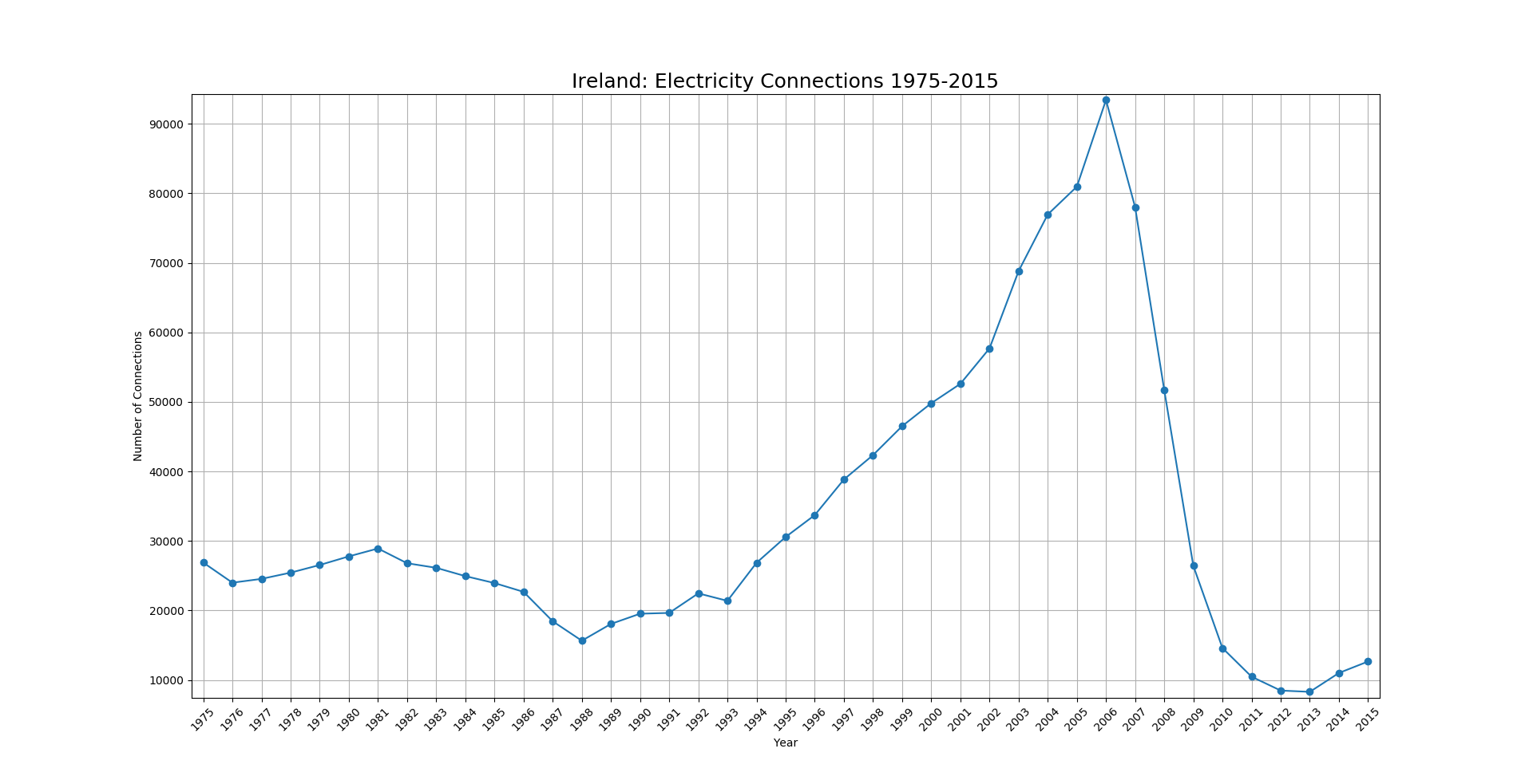
I’ve never really had cause to use Matplotlib before so over the weekend I took a quick look at it and how useful it actually is for creating quick graphs. I took the electricity connections dataset (used as a measure of new homes built, however rough) and created a simple line graph. Below is the code I used and the result.
import matplotlib.pyplot as plt

years1 = ['1975', '1976', '1977', '1978', '1979', '1980', '1981', '1982', '1983', '1984', '1985', '1986', '1987', '1988',
'1989', '1990', '1991', '1992', '1993', '1994', '1995', '1996', '1997', '1998', '1999', '2000', '2001', '2002',
'2003', '2004', '2005', '2006', '2007', '2008', '2009', '2010', '2011', '2012', '2013', '2014', '2015']

scores1 = [26892, 24000, 24548, 25444, 26544, 27785, 28917, 26798, 26138, 24944, 23948, 22680, 18450, 15654, 18068, 19539,
19652, 22464, 21391, 26863, 30575, 33725, 38842, 42349, 46512, 49812, 52602, 57695, 68819, 76954, 80957, 93419, 78027,
51724, 26420, 14602, 10480, 8488, 8301, 11016, 12666]


fig, ax = plt.subplots()
ax.plot(years1, scores1, marker='o')
ax.set(xlabel='Year', ylabel='Number of Connections')
plt.title("Ireland: Electricity Connections 1975-2015", fontsize=18)
ax.grid()
plt.xticks(years1, rotation=45)
plt.margins(0.01)
plt.show()
And here is the resulting graph:
The main strength I’ve seen from it is that it is very easily customisable as well as being a nice addition at various stages of a complex python script in order to error check a methodology in train.
