A topic that I think about frequently is the physical changes Ireland has gone through over the last 10 or 20 years. I’ve covered it before in this blog but I’m going to look at it again today. I think you could ask anybody around the country where the development in their town has been during the Celtic Tiger and this current boom period (well, up until the Covid-19 outbreak anyway) and they would easily be able to tell tell you.
It’s true that we have national indicators from the Central Statistics Office identifying where the most planning permissions have been granted as well as data from the Department of Housing, Planning and Local Government on new ESB connections to show where new homes have been constructed. I was looking for something that would give an idea of the physical development that has occurred in the last 20 years.
Enter the CORINE Land Cover Inventory. It started in 1985 as a way for the European Environment Agency (based in Copenhagen) to monitor the main land uses in the Union. As a little factoid, it stands for Coordination of Information on the Environment. It contains 44 land use classes and the cell size is 100 metres. It already contains layers that show the change between different years but it didn’t contain any change layer from 2000 to 2018. I wasn’t interested in the 44 classes, in fact I was only interested in the categories shown below. I decided to omit construction sites, dump sites and a few other inconsequential categories. These are the main categories that will show development in Ireland between those years.
111 – Continuous urban fabric
112 – Discontinuous urban fabric
121 – Industrial or commercial units
122 – Road and rail networks and associated land
123 – Port areas
124 – Airports
I used the the wonderful r.reclass GRASS tool in QGIS in order to reclassify the rasters for both the year 2000 and the year 2018 to combine these categories. I then used raster algebra in order to subtract the year 2000 from the year 2018 raster in order to show the actual change. Below is a GIF showing the process for an area of North Kerry and Cork.
I create the below map in A1 so you can zoom in to get a good sense of what 18 years of development looks like in a particular county.
Here is a link to the PDF version if you would rather.
*Update*
I redid the map showing the development up to the year 2000 as a separate colour. I’ve also added a legend.
Here is a link to the PDF of this version.
Finally, after a few unsuccessful attempts at converting the final raster to vector I used the gdal_polygonize tool which did it seamlessly without any loss of the smaller cells. Below is the final layer as a web map that you can make full screen.
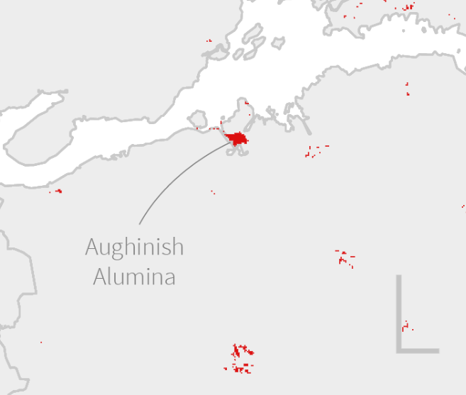
There are a few interesting area that were developed in those 18 years such as Aughinish Alumina in Co. Limerick:
There are also a few windfarms such as this one in Tyrone: