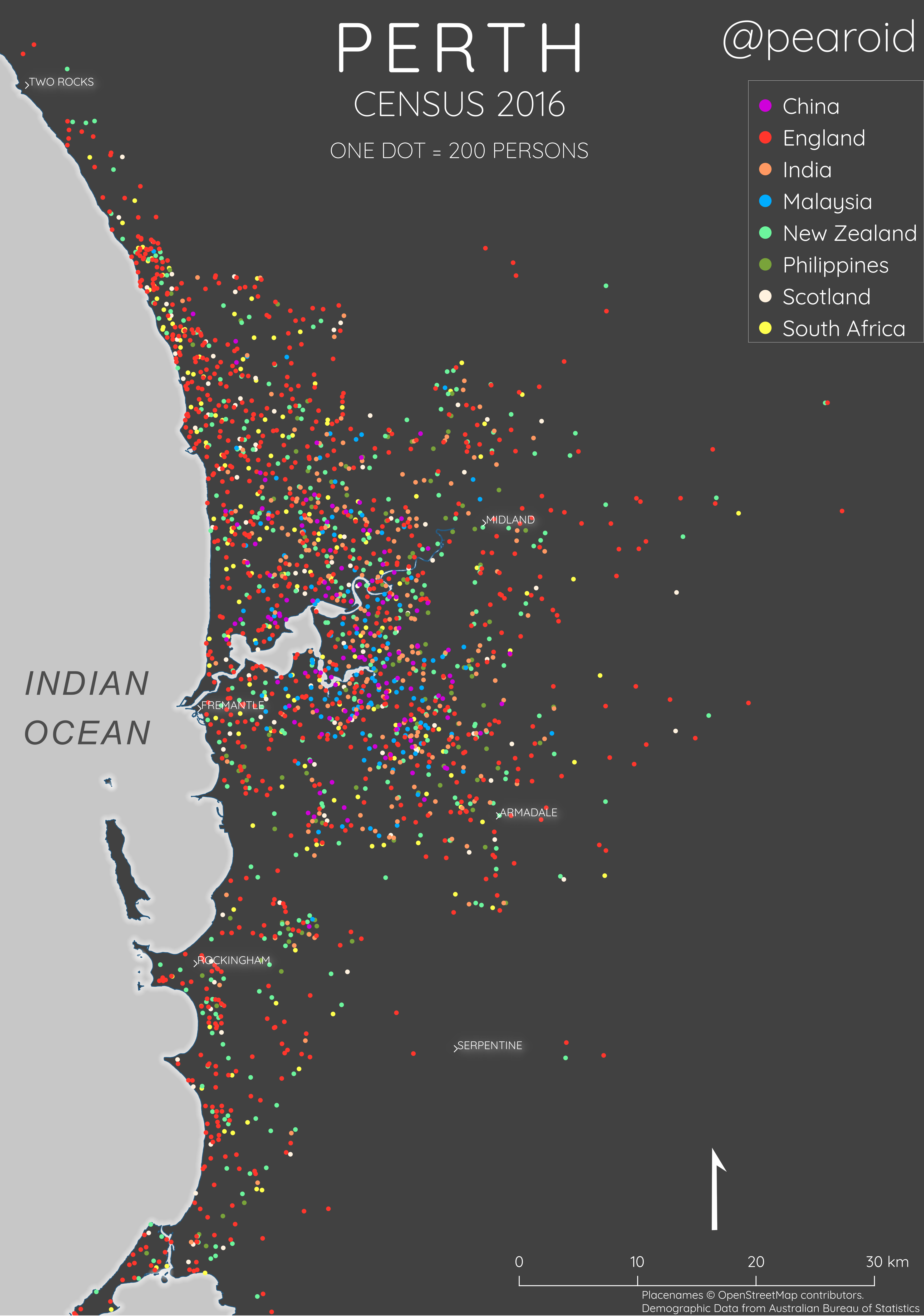
Australia passed the 25 million people mark shortly after 11pm on the 7th of August 2018. This got me thinking, what would a map of Perth look like showing each nationality? Over 28% of Australians was born abroad, what would this translate to in Perth terms?
I took a quick look online to see if anything already existed, the only thing I could find is the below from Perth’s Wikipedia page.
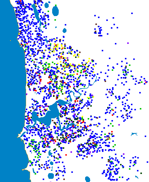
It’s from 2008 and although a gallant effort, there are a few major problems, most notably the lack of a legend. So I decided to see if I could make something, if not better, than as good as the above.
My first job was to source the data, I knew from previously working with ABS data that their pre-built geopackages or datapacks wouldn’t contain the data I needed (question 12 from census ’16) but the geopackages were useful to download the geometry that I needed.
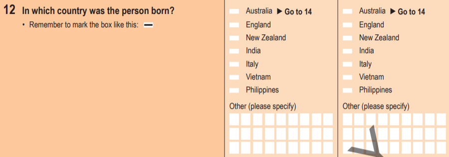
I needed to use the Tablebuilder in order to collate the data that I needed for the geometry that I was going to use. This was the main learning area for me, I didn’t know enough about which unit of statisitical geography I wanted to use for this exercise. Luckily, the ABS have a website where you can compare and contract each unit.
The ABS already had the hard working done in that one of their staticial units is ‘Greater Perth‘, I used this as my boundary and then chose the SA2 as the statistical unit. I went back to Tablebuilder and tried in vain to make sense of it; I found it very cumbersome and non-intuititve to use at the start and their introductory videos weren’t of any help. Fortuntately, I found an amazing video on YouTube that explained Tablebuilder in great detail and once I’d watched that everything made sense, and I’m a Tablebuilder convert now!
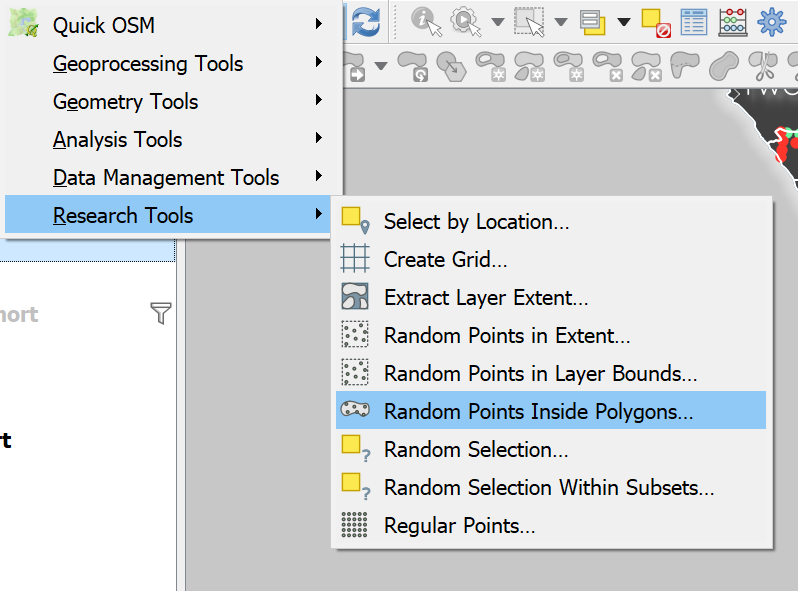
I then used Tablebuilder to build the exact statistics that I needed (Country of Birth by SA2). I saved the table in Tablebuilder and downloaded it as a CSV file. In QGIS I then joined this with the SA2 geopackage file for WA and clipped it using the Greater Perth boundary that I had also downloaded. I then exported this layer as a new geopackage. I had previously found the top 8 nationalities by country of birth (using Tablebuilder) and then created new fields for each one where each number represented 200 persons born in that country. I then used the Random Points Inside Polygons tool to create random points for each nationality.
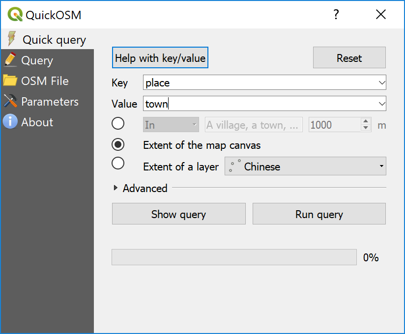
I then used Adobe Color [sic] to pick a decent colour scheme for the various dots. I used Quick OSM in QGIS to download a layer with the towns in Greater Perth to be used for reference, this took about 10 seconds to do, Quick OSM is really useful.
Lastly, I used Google Fonts to download some nice fonts. I also used some styling effects in QGIS before I exported everything to Inkscape in order to add the text. Below is the finished product, the biggest flaw in what I have done is that there are overlapping points but I still think it gives a good overall understading of where people of different nationalities live in Greater Perth.